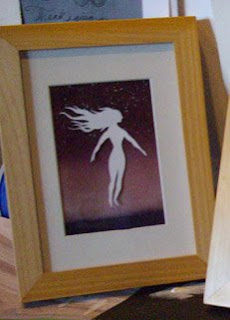
I'm sure that anyone who reads this blog with any amount of frequency has developed a discerning and perceptive taste. Or not.
In any case I am in need of those with discerning and perceptive taste (or at least an opinion) to help me out.
I'm presenting for your consideration these two different takes on the girl piece:
 ______________________________________
The negative point is it was difficult to make a cut-out so small, and the details did not translate well at all. Her face looks bad. I made several and went with one that sort of worked.
---
The positive point of the second one is that the cut-out is much, much better. I got the detail I wanted and it mostly looks just how I want it.
The negative point is that it takes up a lot of the background and I don't get to enjoy the watercolor as much. Also the hair is so long, but I'll bring it out of the mat like I did this one.
I do like the negative space created by her arm in the lower right.
Any feed back would be helpful. This is just one of those conundrums.


8 comments:
i don't want you to lose the beautiful watercolor in option 1...but her neck does look kind of funny. can you compromise? maybe a medium sized figure, offset so you still get the negative space but the lovely background can be enjoyed?
I personally really like the composition of #2. It is striking, where as I think some of the intensity of the piece gets lost in the first one due to the figure being so small. Both are beautiful though - great job!
I'm going with door number #1.
I heart negative space.
Peace. - Caleb
Out of the two I would have to go with the larger one. Although you lose some sky the composition is much more interesting with the negative spaces. What if you just dropped the figure into the lower right hand corner a little more, you'd open up the sky in the upper left but keep most of the negative space, maybe only sacrificing some of the torso.
Love the spray of hair that laps over into the matting in the third. That's my vote.
I like number two the best. I think the positive and negative shapes are delicious, the other two pieces feel awkward to me.
I agree with Brittney and Ken... The second one is more interesting and sophisticated. I like the third one a lot- maybe a cross between the second and third to allow more of the background to show? Also, your gut seems to be leaning toward the second. or third.
Thanks everyone. Carl (ee) you're right, I am leaning toward 2 or 3. I'm leaning toward 3 the most because it gives me more of the figure and lets me see a lot of the sky as well. Also it has more room for the hair because it's smaller than 2.
Thanks again everyone!
Post a Comment