hey thanks~ the ones that generate more interest are the one that are a lot more likely to be actually made.
maybe they'll all be made. i don't know. i would like to see it.
There's already 4 or or 5 differnet Portland Studios tshirt designs ready to be made so i don't know how many of these will be able to be printed right now.
number two is my favorite too. it makes me want to read the story more than the others do. i'm a big fan of your woodcut-looking pieces. keep up the good work!
Well Cory not knowing what the story is really about, I too think the second one has more T-shirt appeal. It is dark and eerie and implies that the goblet is about to be stolen. The first one is just as dark and eerie, yet it looks like Julia is about to be eaten. The third one takes in all aspects of the title and is good work. The last one has the idea that Julia is on a journey searching for the "Blue Goblet." But as far as T-shirts go... #2. All are quality work.
Hmmm...my preference in this sequence: 1. The claw reaching for the goblet (for the mysterious feel, the suspense) 2. Dragon hovering julia. 3. Julia walking against the wind and 4. julia's image on the goblet itself.
always love your dragons but i am leaning more towards the second one… the composition adds such an air of mystery… although nothing is said about julia… maybe the first or the forth would be my choice if i knew more… maybe i'm not much help… too tired… must sleep…
#2 is the one that grabbed me most at first, probably because it's simpler or more graphic or whatever, but the more I think about it the more it reminds me of a cross between Monsters Inc and The Emperor's New Groove.
My next favorite was #4 because of all the flowy lines.
#1 is cool because of the size contrast and the scariness factor.
#3 somehow didn't grab me as much as the others, but if the point is the goblet, then I think it communicates that better than the others.
This is inspireing stuff! I mostly like the second one (counting from the top) becouse it's clean. Lots of black and white and not so many lines. Makes me curious! /M


13 comments:
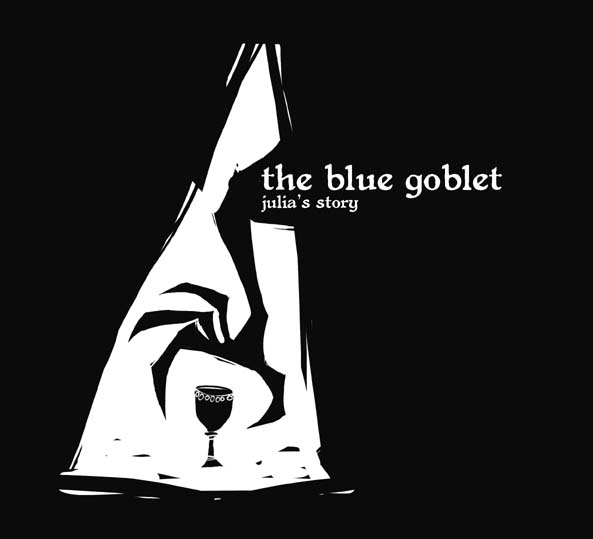
I would have to say i like the hand grabbing the goblet throught the shaft of light the best, but that's just my preference. They all kick butt.
hey thanks~ the ones that generate more interest are the one that are a lot more likely to be actually made.
maybe they'll all be made. i don't know. i would like to see it.
There's already 4 or or 5 differnet Portland Studios tshirt designs ready to be made so i don't know how many of these will be able to be printed right now.
hi cory. emily pitts here. i agree with pete. the second is my favorite. i would buy the first one too. oh! and tell erin i said heeeeello. k bye
number two is my favorite too. it makes me want to read the story more than the others do.
i'm a big fan of your woodcut-looking pieces. keep up the good work!
ooooooooooooh I lke them ALL. But I think #2 works the best.
Well Cory not knowing what the story is really about, I too think the second one has more T-shirt appeal. It is dark and eerie and implies that the goblet is about to be stolen. The first one is just as dark and eerie, yet it looks like Julia is about to be eaten. The third one takes in all aspects of the title and is good work. The last one has the idea that Julia is on a journey searching for the "Blue Goblet." But as far as T-shirts go... #2. All are quality work.
Hmmm...my preference in this sequence: 1. The claw reaching for the goblet (for the mysterious feel, the suspense) 2. Dragon hovering julia. 3. Julia walking against the wind and 4. julia's image on the goblet itself.
always love your dragons but i am leaning more towards the second one… the composition adds such an air of mystery… although nothing is said about julia… maybe the first or the forth would be my choice if i knew more… maybe i'm not much help… too tired… must sleep…
#2 is the one that grabbed me most at first, probably because it's simpler or more graphic or whatever, but the more I think about it the more it reminds me of a cross between Monsters Inc and The Emperor's New Groove.
My next favorite was #4 because of all the flowy lines.
#1 is cool because of the size contrast and the scariness factor.
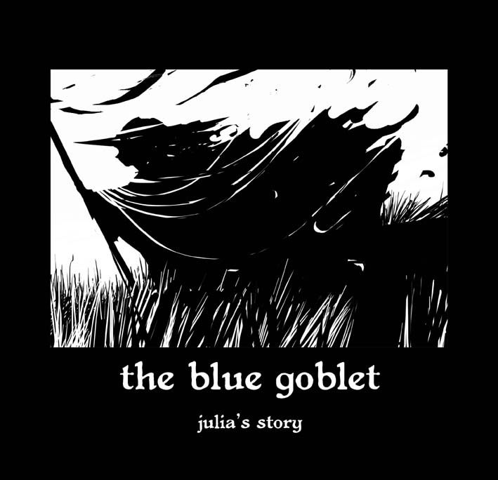
#3 somehow didn't grab me as much as the others, but if the point is the goblet, then I think it communicates that better than the others.
wow. #2 is kick-everything awesome.
#2 is boss. The "grommet-dots" are stell.
This is inspireing stuff! I mostly like the second one (counting from the top) becouse it's clean. Lots of black and white and not so many lines. Makes me curious!
/M
Inspiring!!
Post a Comment